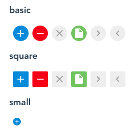
k-icon-buttonコンポーネントはボタンとして使用されます。
デモ
使い方
<template>
  <k-icon-button type="insert" color="blue" />
  <k-icon-button type="remove" color="red" />
  <k-icon-button type="close" color="gray" />
  <k-icon-button type="file" color="green" />
  <k-icon-button type="right" color="gray" />
  <k-icon-button type="left" color="gray" />
</template>
Attribute
| Name | Description | Type | Required |
|---|---|---|---|
| color | ボタンの色. ・gray ・blue ・red ・green ・transparent デフォルト値: ‘gray’ |
String | No |
| disabled | disabled にするかどうか. デフォルト値: false |
Boolean | No |
| shape | ボタンの形. ・circle ・normal ・none デフォルト値: ‘circle’ |
String | No |
| size | ボタンのサイズ. ・medium ・small ・x-small デフォルト値: ‘medium’ |
String | No |
| type | ボタンの種類. ・insert ・remove ・close ・file ・right ・left ・マテリアルアイコンのプロパティ名 |
String | No |
Event
| Name | Description |
|---|---|
| click | ユーザーの操作によってボタンが押されたときに発生する。 |